Deanna McCool is a writer and technical editor for the sewing and crafting industry. She’s here with some easy color theory tips to help you select prints for quilting. Learn how concepts like light vs. dark, saturation, complementary colors and proportion impact how effective your color selection may be in a quilt project.
When I was a freshman in college and starting classes for my art minor, the professor of our Color and Design course started the first class with a question: “How can you make one color look like a different color?”
We were stymied.
He let us flounder around a little with our package of special art papers. We were moving them around and kind of staring at each other, hoping someone would save us. Then the professor took a brown piece of paper, cut it into two thin strips, and laid one strip on top of a bright green piece of paper and the other brown strip on top of a red piece of art paper.
It was like magic! The brown looked reddish on the green paper and greenish on the red paper. They didn’t look like the same color– not at all.
Since starting my sewing life as a quilter in 2001, I’ve often thought about the lessons I learned in that class many times over. Selecting fabrics for quilts can be a tricky business, made even trickier by the myriad fabric colors and designs we have to choose from.
But color theory doesn’t have to be stressful or scary. We can use some of the principles written about in Johannes Itten’s groundbreaking books, The Elements of Color and The Art of Color. In addition to the theory that colors react differently when they’re next to other colors, here are some other theories that can help quilters decide on fabrics for their quilts.
The Contrast of Light + Dark
“When I’m designing any pattern I don’t think about any specific color. I think about VALUE. The lights, mediums, darks… It’s a continuous scale,” said Becky Goldsmith, author of 31 books, seven Blocks of the Month and a variety of stand-alone patterns with business partner Linda Jenkins. Her most recent book, The Quilter’s Practical Guide to Color, was published in March 2015 through C&T Publishing.
“You have to have a change in value,” she said.
When she lays the pattern out in Adobe Illustrator she first thinks about value, and she thinks about it in terms of what will be considered the foreground of the quilt, and what will be the background. Appliqué and pieced quilts both have a foreground and background. “If you dissect a quilt in this way, it makes it easier to color,” Goldsmith said.
The concept of contrast is so important in quilting that it can sometimes trump the color completely. Take this quilt, part of a challenge Becky accepted when she asked people to send their “ugliest” fabrics to her.

An easy way to see value in your quilt is to take a photo of it, and then filter it to black and white, said Jeni Baker, a designer for Art Gallery Fabrics who has written a popular series of posts on color on her blog, In Color Order. Her book, Patchwork Essentials: The Half-Square Triangle: Foolproof Patterns and Simple Techniques from Basic Blocks, through Lucky Spool Media, hits shelves in October.
The Contrast of Saturation
Another factor that affects how we color our quilts is that of saturation. Think about it… There are a lot of grayed and muted colors on the market. When should you use less saturated color, and when should you use a more saturated one?
Becky refers to this issue as one of color clarity. You can use both types of fabric colors in one quilt, Becky says, but be aware of your foregrounds and backgrounds. “[The] problem is when you mesh them together, clear colors go forward and gray colors go back,” she said. “Think about it. Things that are far away are grayed out. We interpret distance that way.”
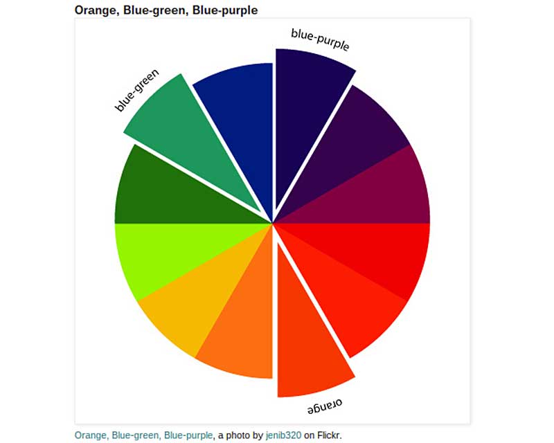
The Contrast of Complements
Most of us already know about the color wheel, where colors opposite of each other are paired together in a quilt. Red complements green, blue-purple complements yellow orange, and purple complements yellow.
“If you want to do blue in a quilt, you can’t go wrong with orange too,” Goldsmith said. Right now, Baker is in love with using eggplant purple and mustard (she calls them her “comfort colors”), which is a perfect example of complementary colors.
My daughter loves orange so I’m going to give her this work-in-progress wall quilt that features blue, orange and yellow-green; it’s a great example of how two complementary colors can be mixed with a bright background color. (My dog thinks all quilts– even unfinished ones– are for her to lounge upon!)

Using split complementary colors is another option, Jeni said. In her post about split-complementary colors, she shares the 12 different split-complementary combinations. Essentially, when deciding on a split complementary color scheme, you’ll choose one color and look across the color wheel to its complement. But instead of using the complement, you’ll use the two colors on either side of the complement. Here’s an illustration from Baker’s blog that describes this color scheme:
The Contrast of Proportion
Beginning quilters are often told to select a main fabric– a print– and to pick colors from that fabric to color the rest of their quilt. While that can work, it’s not the most effective strategy, Goldsmith said. This is because the proportion of color– and how colors react with each other (like my example of how brown looked differently on both the red and the green paper)– really has an effect on the final appearance of the quilt.
Relying on the spots of colors along the selvage of a fabric can cause headaches later. “If you’re looking at those dots, one of the colors may only be a pin prick,” Becky said. “But if you use everything at face value and use them in equal percentage, you can end up with a big mess.”
The Contrast of Warm + Cool
Warm colors are the reds, yellows and oranges, and cool colors are the blues, greens and purples. But even some warm colors can read “cooler” and some cool colors can read “warmer,” depending on where they’re placed in a quilt and how much of each you use.
Here’s a stack Jeni pulled from her stash. The cool colors are on the left, with the warmer ones on the right.

In her blog post about warm vs. cool colors, Jeni suggested that when using them in a quilt– at least one where you’re looking to play off the warm vs. cool theme– select fabrics without accents in the opposite “warmth;” a red fabric with gold accents would work, but a red fabric with blue accents wouldn’t.
If you’re shopping and can’t tell whether a color is more warm or more cool just ask a friend, or audition it with the other fabrics you’re using in the quilt. There are many other ways to use color in your quilts, but try out some of the above tips if you’re stuck in a color rut!
In the End, Use Your Own Judgment
Really, there are no “bad” color combinations. But there might be some that you simply don’t like, for one reason or another. Becky doesn’t like mauve pink or dusty blue, grayed colors used in the early-to-mid-1980s. And Jeni doesn’t like red and green paired together. No matter how they’re combined, they read “Christmas” to her.
While it’s a good idea to occasionally try a color palette outside of your comfort zone, it’s not always productive if you’ll never use the quilt. “There are merits to [pushing yourself outside your comfort zone], but if you’re going to put all your time and effort into it, you want to make sure you finish it,” Jeni said. “There’s definitely times when I want a challenge– I’ll go outside of my comfort zone– but if I’m just making something fun, then I’m totally cool with my ‘comfort food’ choices.”
Jeni is currently working on a quilt with a mint green background color which is totally out of her comfort zone, but she’s excited about how it’s coming out so far.
Becky was initially nervous when she collected all of those supposedly “ugly” fabrics for her challenge quilt. But in the end, the result was surprising. “Boy, it really worked!” she said of the final quilt.